Friday 7 May 2010
Front cover for music magazine

This is my final front cover for my magazine i have addressed the problem of not being able to see the caption for the main image by changing the the font and the colour of the font.
First draft front cover for music magazine
 This is my draft for the magazine front cover. i have used lots of things that will attract an audience. i have used a puff in the corner for one of the more attractive stories in the magazine. I have also used a house style on this with the masthead and it is continued throughout the magazine. i have used a pug for the bar code ad the price in the top left corner. i believe that the caption for the main image isnt very readable so this is a problem that i need to address.
final Contents page for music magazine

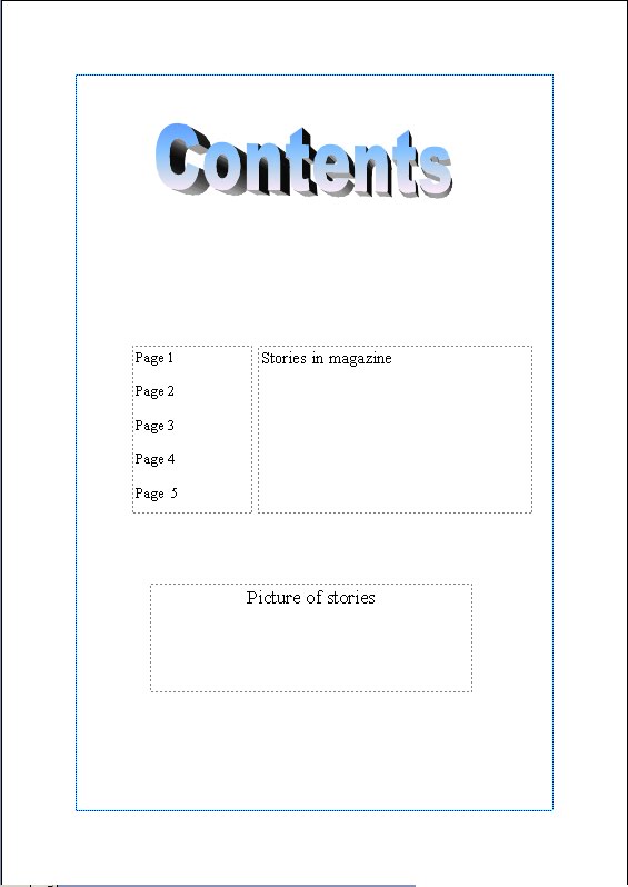
This is my final contents magazine page. I believe this is a good style for this magazine because it is easy to read and it is also easy to read. i had to address the problem of not being able to read the blue writing so i changed the colour of blue that was used on the first draft.
first draft contents page for music magazine
 This is my first attempt at my contents page for my magazine that i am producing. I think it has the right stuff on it but i felt it wasnt the right sort of style for the genre i am looking at. I have used buz words and kept to a house style with the masthead of the magazine.
Final double page spread for music magazine

This is my final double page spread design i have kept everything the same apart from the fact that i have changed the colour of the writing in the article and also the arrow in the corner of the page. I have done this so that it is easier to read the writing, and i had to change the colour of the arrow to keep to the same design.
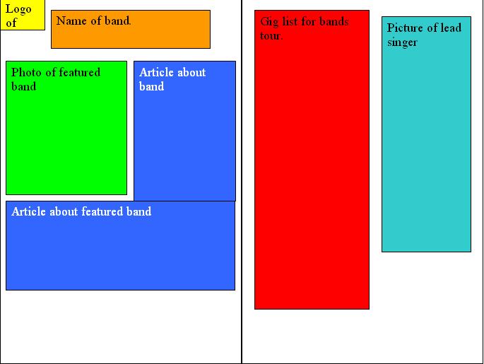
first draft double page spread for music magazine
 this is my double page spread that i have produced. i have used many techniquies in this such as having a house style in my magazine and keping it throughout the magazine. i have used buzz words such as "exclusive" to make the article more appealing as if it is a once in a life time opportunity. This has not turned out the way that i wished it would because when i have poted it the colours have not come out the way i wanted, the blue writing looks purple and is not easy to read on here ad this is something that i must address.
College magazine contents mock up
i believe this contents page is better than a school one becuase i have made it more colourfull therefore it will be more attractive to people.
College magazine front cover mock up

The quality of this newsletter is not the best because it was made on publisher i have used more colourfull features on this to make it more attractive than the origional one.
Tuesday 13 April 2010
double page spread mock up
 i believe that this format i have layed out is a simple but effective because it is clear where all the information is.
front cover mock up
 i think this is style stands out and will ake the audience notice it and want to but the magazine that i am producing.
Wednesday 7 April 2010

Monday 22 March 2010
photoshop practice
 In this picture i have used a filter which is called film grain which gives the image a different look, there are many different filters i chose this one because i think it is one of the best ones for this image.
 this is what i did to it first of all using liquify changing the shape of his face. i have made things on this go bigger using the bloating tool. I have used the pucker tool on places to make it smaller in places.i have used the warp tool in places which just lets me move parts of the image around.
 This image is the image i started with of Micheal Jackson which i obtained using google to do some photo shopping practice.
Tuesday 16 March 2010
mood board

this is my mood board. the pictures i have used are all related to the genre i am doing which is indie/rock. I have used mainly pictures from NME magazine, i have picked pictures with mise en scene related to this genre such as guitars because people in this genre usually have a guitar in their band. I have used pictures of clothing that people in this genre wear. Also i have used band names in it. I also have a picture of a magazine that is related to this genre this magazine is called uncut. I think the choices i have made for my mood board are good because they all relate to the genre of indie/rock.
Monday 15 March 2010


Monday 8 March 2010

Wednesday 3 March 2010

Tuesday 2 March 2010
photoshop practice

This is one of my first attempts at photoshoping i have done superman in black and white but leaving some of the colours on his suit to make them stand out.
Thursday 4 February 2010
Deyes high school newsletter
This is the newsletter from deyes high school, it has been decided within our class that it is too boring and it will not appeal to people.

- It hasnt got much colour to it mainly white and grey.
- The images that are on it are boring.
- It has no structure to it as you cant see the logo clearly.
- It has a house style, the same style for every edition.
- There is no copy on the front to make people want to read it.
- There is anchorage text to link the pictures and the text to show the pictures are about Deyes high school.
To start my research i have made a questionnaire to find out what my audience thinks.
to answer my questionnaire click here
to answer my questionnaire click here
newsletter

This is my design for my college magazine this might be changed in the future depending if i can make improvements to make the target audience more attracted to it.
Genre of my music magazine
The genre for my music magazine is going to be indie/rock, i have decided on using this genre because it is a genre that i like to listen to, the pictures i am showing below are of bands that i listen to.These bands in order are, kasabian, the killers, arctic monkeys and all time low.


Tuesday 19 January 2010
brief description of coursework
For my media coursework i will need to produce a front cover of a music magazine; a contents page and a double spread on an artist of my choice. i will be marketing my magazine for a young audience in todays society because recently it has become difficult for the music industry to get the attention of young audiences. These are the things i need to do;
-Choose a genre
-product research for 2 music magazines
-2 front covers
-2 contents pages
-2 double page spreads
-college magazine font cover which has to be medium close up
-mood board
-mock-ups of magazines
-Choose a genre
-product research for 2 music magazines
-2 front covers
-2 contents pages
-2 double page spreads
-college magazine font cover which has to be medium close up
-mood board
-mock-ups of magazines
Subscribe to:
Posts (Atom)