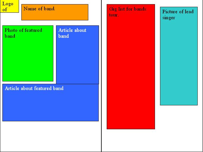
 i believe that this format i have layed out is a simple but effective because it is clear where all the information is.
Tuesday, 13 April 2010
double page spread mock up
i believe that this format i have layed out is a simple but effective because it is clear where all the information is.

front cover mock up
 i think this is style stands out and will ake the audience notice it and want to but the magazine that i am producing.
Wednesday, 7 April 2010

Monday, 22 March 2010
photoshop practice
 In this picture i have used a filter which is called film grain which gives the image a different look, there are many different filters i chose this one because i think it is one of the best ones for this image.
 this is what i did to it first of all using liquify changing the shape of his face. i have made things on this go bigger using the bloating tool. I have used the pucker tool on places to make it smaller in places.i have used the warp tool in places which just lets me move parts of the image around.
 This image is the image i started with of Micheal Jackson which i obtained using google to do some photo shopping practice.
Tuesday, 16 March 2010
mood board

this is my mood board. the pictures i have used are all related to the genre i am doing which is indie/rock. I have used mainly pictures from NME magazine, i have picked pictures with mise en scene related to this genre such as guitars because people in this genre usually have a guitar in their band. I have used pictures of clothing that people in this genre wear. Also i have used band names in it. I also have a picture of a magazine that is related to this genre this magazine is called uncut. I think the choices i have made for my mood board are good because they all relate to the genre of indie/rock.
Monday, 15 March 2010


Subscribe to:
Posts (Atom)